Add styled features box to any page/post/portfolio post. 12 different features box style with style and configuration settings.
Please follow below steps to use “Features Box” shortcode.
- Step 1: Login to WordPress Admin section.
- Step 2: Add/Edit any page/post/portfolio post.
- Step 3: Click on “+” button (Add New Element), it will show the popup with all shortcodes.
- Step 4: Click on Brando tab, it will show all shortcodes of Brando theme. Now click on “Features Box” shortcode.
- Step 5: Follow below inputs/settings and see “Features Box” preview in frontend.
General (tab)
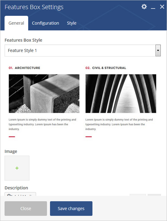
If Feature Style 1 is selected:
Feature Style – Select feature style from 10 pre-defined styles (Feature Style 1, Feature Style 2, Feature Style 3, Feature Style 4, Feature Style 5, Feature Style 6, Feature Style 7, Feature Style 8, Feature Style 9, Feature Style 10, Feature Style 11 and Feature Style 12). Each style has preview image, it will help you to select best style you like.
Number Text – Add text for number.
Title – Add text for title.
Image – Select or upload image.
Description – Add content for description.
Enable Separator – Yes/No options
General (tab)
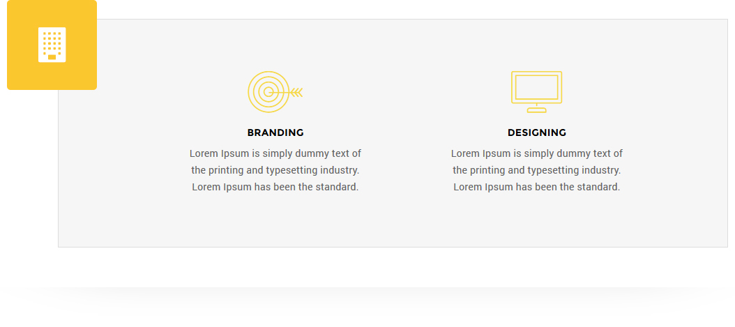
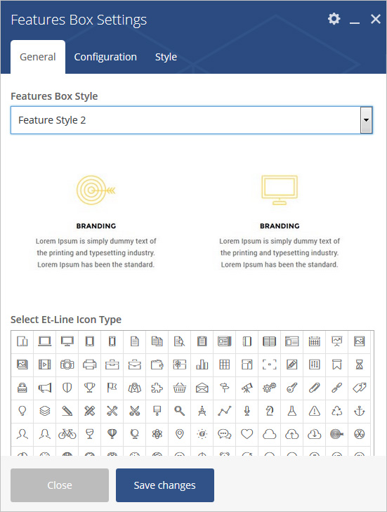
If Feature Style 2 is selected:
Feature Style – Select feature style from 10 pre-defined styles (Feature Style 1, Feature Style 2, Feature Style 3, Feature Style 4, Feature Style 5, Feature Style 6, Feature Style 7, Feature Style 8, Feature Style 9, Feature Style 10, Feature Style 11 and Feature Style 12). Each style has preview image, it will help you to select best style you like.
Select Et-Line Icon Type – Select Icon from pre-defined list of icons.
Title – Add text for title.
Description – Add content for description.
Box With Gray Border – Add Box With Gray Border.
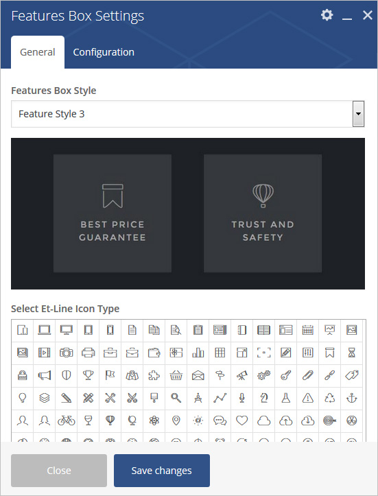
General (tab)
If Feature Style 3 is selected:
Heading Style – Select feature style from 10 pre-defined styles (Feature Style 1, Feature Style 2, Feature Style 3, Feature Style 4, Feature Style 5, Feature Style 6, Feature Style 7, Feature Style 8, Feature Style 9, Feature Style 10, Feature Style 11 and Feature Style 12). Each style has preview image, it will help you to select best style you like.
Select Et-Line Icon Type – Select Icon from pre-defined list of icons.
Title – Add text for title.
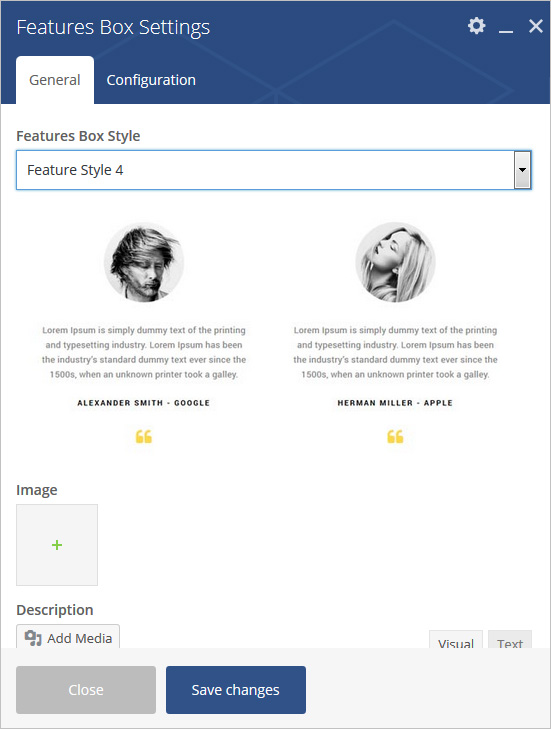
General (tab)
If Feature Style 4 is selected:
Feature Style – Select feature style from 10 pre-defined styles (Feature Style 1, Feature Style 2, Feature Style 3, Feature Style 4, Feature Style 5, Feature Style 6, Feature Style 7, Feature Style 8, Feature Style 9, Feature Style 10, Feature Style 11 and Feature Style 12). Each style has preview image, it will help you to select best style you like.
Select Et-Line Icon Type – Select Icon from pre-defined list of icons.
Title – Add text for title.
Image – Select or upload image.
Description – Add content for description.
Enable Icon Yes/No options.
General (tab)
If Feature Style 5 is selected:
Feature Style – Select feature style from 10 pre-defined styles (Feature Style 1, Feature Style 2, Feature Style 3, Feature Style 4, Feature Style 5, Feature Style 6, Feature Style 7, Feature Style 8, Feature Style 9, Feature Style 10, Feature Style 11 and Feature Style 12). Each style has preview image, it will help you to select best style you like.
Select Et-Line Icon Type – Select Icon from pre-defined list of icons.
Title – Add text for title.
Description – Add content for description.
Enable Separator – Yes/No options

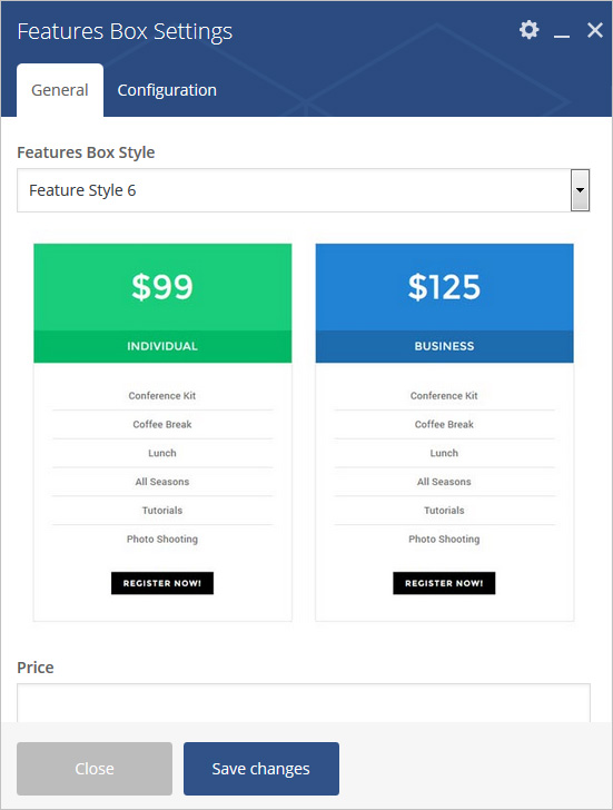
General (tab)
If Feature Style 6 is selected:
Feature Style – Select feature style from 10 pre-defined styles (Feature Style 1, Feature Style 2, Feature Style 3, Feature Style 4, Feature Style 5, Feature Style 6, Feature Style 7, Feature Style 8, Feature Style 9, Feature Style 10, Feature Style 11 and Feature Style 12). Each style has preview image, it will help you to select best style you like.
Price – Add text for price.
Title – Add text for title.
Button Config – Set button text and URL.
Description – Add text for description.
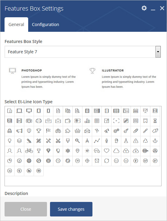
General (tab)
If Feature Style 7 is selected:
Feature Style – Select feature style from 10 pre-defined styles (Feature Style 1, Feature Style 2, Feature Style 3, Feature Style 4, Feature Style 5, Feature Style 6, Feature Style 7, Feature Style 8, Feature Style 9, Feature Style 10, Feature Style 11 and Feature Style 12). Each style has preview image, it will help you to select best style you like.
Select Et-Line Icon Type – Select Icon from pre-defined list of icons.
Title – Add text for title.
Description – Add content for description.
General (tab)
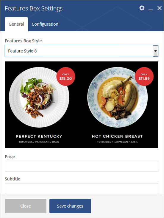
If Feature Style 8 is selected:
Feature Style – Select feature style from 10 pre-defined styles (Feature Style 1, Feature Style 2, Feature Style 3, Feature Style 4, Feature Style 5, Feature Style 6, Feature Style 7, Feature Style 8, Feature Style 9, Feature Style 10, Feature Style 11 and Feature Style 12). Each style has preview image, it will help you to select best style you like.
Price – Add text for price.
Title – Add text for title.
Sub Title – Add text for sub title.
Image – Select or upload image
General (tab)
If Feature Style 9 is selected:
Feature Style – Select feature style from 10 pre-defined styles (Feature Style 1, Feature Style 2, Feature Style 3, Feature Style 4, Feature Style 5, Feature Style 6, Feature Style 7, Feature Style 8, Feature Style 9, Feature Style 10, Feature Style 11 and Feature Style 12). Each style has preview image, it will help you to select best style you like.
Select Et-Line Icon Type – Select Icon from pre-defined list of icons.
Title – Add text for title.
Description – Add content for description.
Enable Separator – Yes/No options.

General (tab)
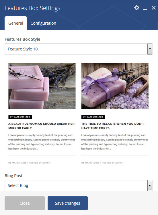
If Feature Style 10 is selected:
Feature Style – Select feature style from 10 pre-defined styles (Feature Style 1, Feature Style 2, Feature Style 3, Feature Style 4, Feature Style 5, Feature Style 6, Feature Style 7, Feature Style 8, Feature Style 9, Feature Style 10, Feature Style 11 and Feature Style 12). Each style has preview image, it will help you to select best style you like.
Blog Post – Select blog post.
Image – Select or upload image
Enable Separator – Yes/No options.
General (tab)
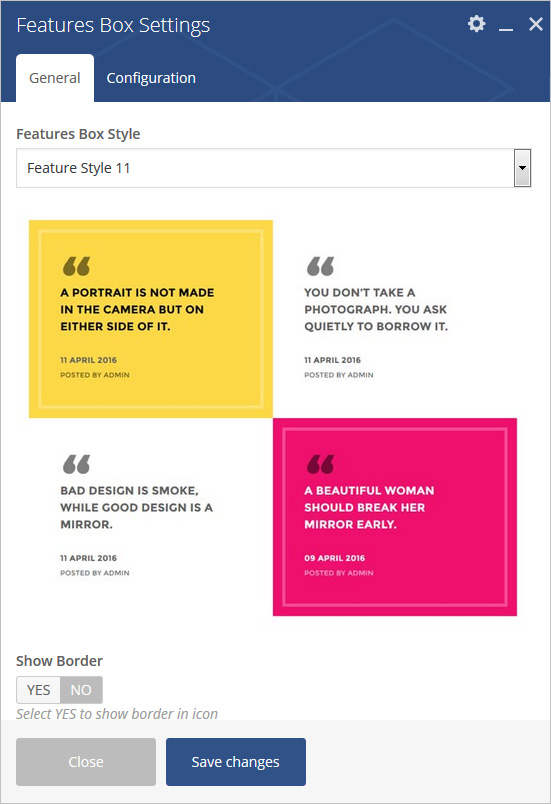
If Feature Style 11 is selected:
Feature Style – Select feature style from 10 pre-defined styles (Feature Style 1, Feature Style 2, Feature Style 3, Feature Style 4, Feature Style 5, Feature Style 6, Feature Style 7, Feature Style 8, Feature Style 9, Feature Style 10, Feature Style 11 and Feature Style 12). Each style has preview image, it will help you to select best style you like.
Show Border – Select Yes to show Border
Blog Post – Select blog post.
General (tab)
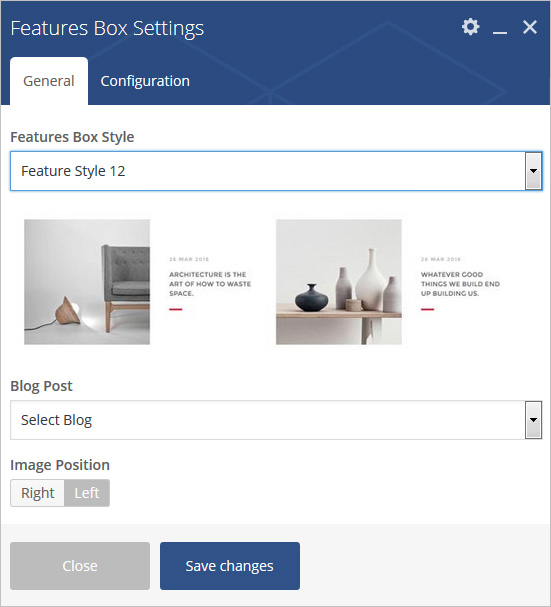
If Feature Style 12 is selected:
Feature Style – Select feature style from 10 pre-defined styles (Feature Style 1, Feature Style 2, Feature Style 3, Feature Style 4, Feature Style 5, Feature Style 6, Feature Style 7, Feature Style 8, Feature Style 9, Feature Style 10, Feature Style 11 and Feature Style 12). Each style has preview image, it will help you to select best style you like.
Blog Post – Select blog post.
Image Position – Select Image Right Or left side.
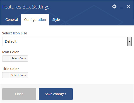
Configuration (tab)
Settings are different as per feature style selected:
Select Icon Size – Select icon size from pre-defined size list.
Icon Color – Set icon color.
Title Color – Set title text color.
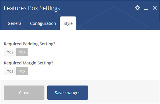
Style (tab)
Settings are different as per feature style selected:
Padding – Apply padding with pre-defined padding classes or specify your custom padding for desktop/tablet/mobile devices.
Margin – Apply margin with pre-defined margin classes or specify your custom margin for desktop/tablet /mobile devices.